textile colour research
Chromarama
Client Name
self-initiated
Year
2020-2021
Project Details
Textile Design
Project Scope
a textile study on colour blindness
For most of us, colour is an obvious part of our visual perception. Yet 1 in 12 men and 1 in 200 women have some form of colour vision deficiency, better known as colour blindness. This equates to 1 person in every class and 300 million people worldwide.
Most colourblind people can see colours but have difficulty distinguishing certain colours. They often accept two colours as a match, while those with unaffected colour vision see them as very different colours.
The work sprouts from the desire to raise awareness about colour blindness in the design field. How can we include colour vision defects in both functional and aesthetic design?
Following extensive research in cooperation with a colourblind peer group, Kukka developed a pioneering series of tapestries that caters to people with colour vision deficiency. Graphic colour compositions and textural threads come together to create an aesthetic display that not only looks beautiful, but can be appreciated by everyone.

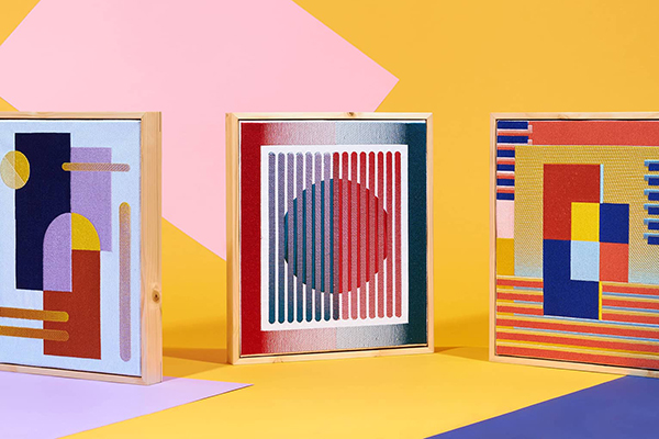
The Chromarama Tapestries
jacquard woven
Each tapestry has its own function. The designs are always visible, regardless of the viewer’s form of impaired colour vision. The highly graphic compositions from a distance reveal a new world full of colour detail and tactility as you get closer. The interplay of colour, texture and material continues to amaze.


Chromarama I
Jacquard woven tapestry, 175 cm (w) x 185 cm (h), 2021
Tapestry “Chromarama I” is designed for a mild red/green colour vision defect, the most common form. The design remains visible, while some colours change appearance.
Use the arrows to view colour blind simulations of this design.


Chromarama III
Jacquard woven tapestry, 175 cm (w) x 185 cm (h), 2021
Tapestry “Chromarama III” is designed for red/green colour blindness. Only colours that are visible for this form of colour blindness are used, so that we all see the same colours and design.
Use the arrows to view colour blind simulations of this design.


Chromarama V
Jacquard woven tapestry, 150 cm (w) x 170 cm (h), 2021
Tapestry “Chromarama V” is designed for both red/green and blue colour blindness, with patterns that look different to people with colour vision deficiency than to people with normal colour vision. Use the arrows to view colour blind simulations of the patterns in this design.
The simulation video with Red-Green-Blue (RGB) light clearly shows how the patterns change when one of the RGB channels is turned off.


Chromarama II
Jacquard woven tapestry, 150 cm (w) x 170 cm (h), 2021
Tapestry “Chromarama II” is designed for both red/green and blue colour blindness. The design remains visible, while some colours change appearance.
Use the arrows to view colour blind simulations of this design.


Chromarama IV
Jacquard woven tapestry, 175 cm (w) x 185 cm (h), 2021
Tapestry “Chromarama IV” is designed for blue colour blindness. Only colours that are visible for this form of colour blindness are used, so that we all see the same colours and design.
Use the arrows to view colour blind simulations of this design.


Developed in the renowned TextielMuseum | TextielLab
Design Process
problem colours
At first, a selection was made of colours and colour combinations that colourblind people have difficulty with. The focus here is mainly on red/green blindness, as this form is the most common. The below selection of coloured paper was used as a visual reference to which colour combinations to avoid.

Artist’s Palettes
a comparative study
By analysing works of art by well-known colour masters, it was examined whether these artists have a natural feeling for choosing colours and contrasts that are well perceived by colour blind people. In general, the works of art do not lose their essence, but some colours become grey and indistinguishable, as well as some shapes.
Below simulations shows how the colours change when perceived by a person with red/green blindness and blue blindness.
The conclusion: even colour masters do not consciously or subconsciously take colour blindness into account.


Weaves
warp and weft
Research has also been done into different weaves where several colours of yarns are combined to form a dominant visible colour. These digital sketches of satin weave in different colour threads show the colour difference between a black and white warp and the dominant colour that becomes visible.


Yarn Windings
selecting colours
Through yarn windings, the colours and shades are selected that can be clearly distinguished for the different forms of colour blindness.


Project
Concept and Design
Laura Luchtman, Kukka
Development at TextielMuseum | TextielLab
Product development: Judith Peskens
Technical assistance: Perry van den Hout, Michel Leermakers, Ron van der Pol, Frans Verbunt
Hand finishing: Ingrid Staps
Planning & coordination: Babette Pörtzgen
Process portrait photography: Iris Tempelaar
Launch exhibition at De Wasserij
Lighting: Quintus Belichting
Exhibition installation and plinth: Maurice Meewisse
Photography: Roza Schous
PR: Nancy van Oorschot
Product photography
Wijnand van Till for Studio van Soest
3D Visualisations
PF Visual
Press
Dezeen
Elle Decoration
WOTH
Cover Magazine
Cool Hunting
FRAME
Exhibitions
De Wasserij
OBJECT Rotterdam
Priveekollektie Contemporary Art | Design
Dutch Design Week
Milan Design Week
Awards
Isola Design Awards 2022 (Best Textile Design) – Shortlist
Dezeen Awards 2021 (Best Homeware Design) – Shortlist, winner 3rd place public vote